
Brand Strategy
What is Brisll?
Brisll is an oral care brand created with the idea that friendly, environmentally sustainable design can elevate the idea of a simple toothbrush into something that consumers around the world will feel safe about integrating into their morning routine.
Brand
Brisll would follow more modern design trends, utilizing thin line graphics, soft colors, and simple visual patterns to imply a feeling of cleanliness, and to avoid making the consumer feel like they are being overloaded with visual stimulation when looking at the package.
Brand Colors
The color system for Brisll was inspired by colors already associated with oral hygiene and dental themes. The soft blue is used to imply a friendly brand tone, but also to reference cleanliness, and freshness, while pink is an obvious visual reference to the gums and mouth.
Brand Patterns
Brisll’s pattern system is simple, consisting of semi-transparent circles overlapping one another, as well as the circles and crosses shown above, referencing suds produced when you brush your teeth, and also the sparkle desired by everyone who prefers a perfectly white smile.
Typography
Poiret One was chosen as Brisll’s primary typeface, due to it’s thin san serif style, and similarity of weight to the brand pattern and primary logo.
Logo
Many concepts were explored before the final logo design was settled upon. The lightweight approach was chosen due to its cleanliness, seeking to stand out from other over-designed dental hygiene brands that use bold, in-your-face shapes.
Brand Process Work

Why?
Every time we walk through a retail store, we are taunted by small but marginally useful items, usually priced within the $1-5 range. Due to their low price, we are compelled to just drop them in our basket and carry on with our shopping experience.
The problem with these products is that they are often incredibly over packaged, using significantly more plastic and non-recyclable materials than what is necessary.
The goal for this project was to select a product fit for a full brand redesign while also giving their packaging a eco-friendly facelift.
This triple pack of travel toothbrushes stood out to me specifically because of the wild overuse of plastic, and complete lack of any sort of visible brand whatsoever.
While overall this package does the job it was created to do, much could be done in the way of streamlining the overall design and reducing the amount of materials used.

Prototypes
I began the process of creating the Brisll brand by creating prototypes for potential package designs

This prototype was focused on utilizing the provided travel cases, binding them together using a belly band. Ultimately, this was passed over because of its use of plastic, and lack of overall structural integrity.
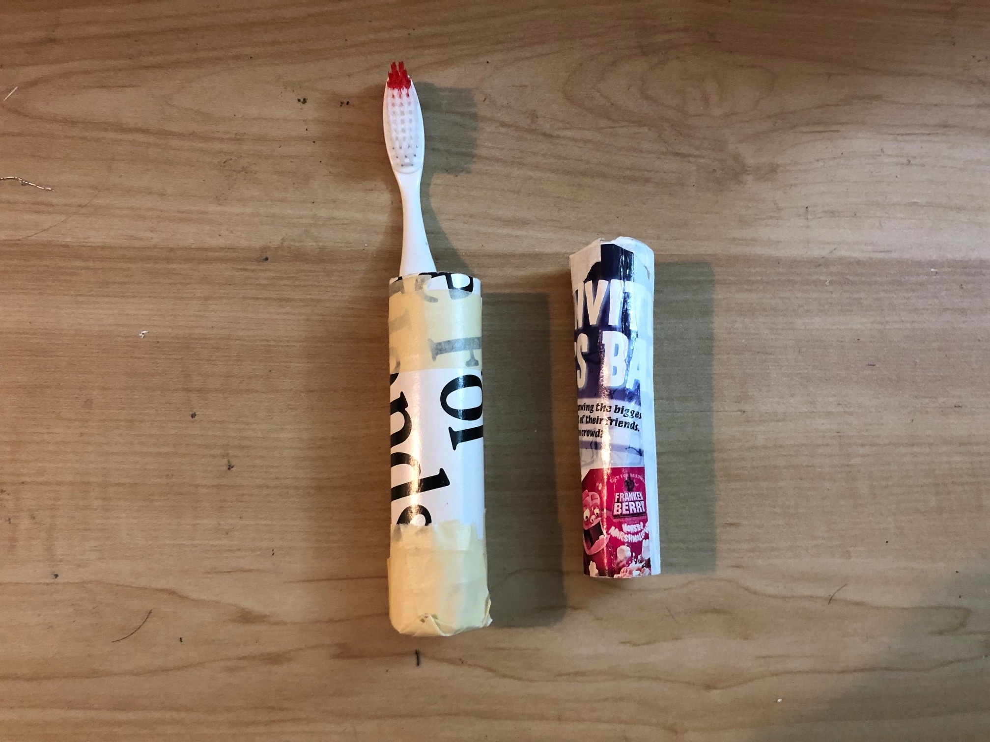
My second idea sought to mimic the included plastic travel case, but with cardboard or thick paper replacing the non-recyclable elements.
It would be sort of awkward to fit a toothbrush and a tube of toothpaste into this, and it seemed too difficult to shape the cardboard properly for a real final design.

The final design for the package is a hexagon shaped box that would open down the middle, allowing the user to open the box and prop their toothbrush inside a form-fitting stand.
The hexagonal shape would allow the package to stand out amongst its competitors, as well as provide something that wouldn’t roll or slide around on a shelf or counter, much like a round case would.

Unbranded Packaging Dieline

Branded Package Dieline
To better understand the way the final packaging would look, unbranded and fully mocked up dielines were created.
Final Product
Side A
Top
Side B
